Bricolage is a student-run publication at the University of Washington. Its goal is to collect a wide variety of student art and writing, and compile an annual collection. I served as the visual arts and layout editor for the 2019-2020 school year. I had the honor of reviewing visual art pieces and designing the layout for Bricolage Issue 38.
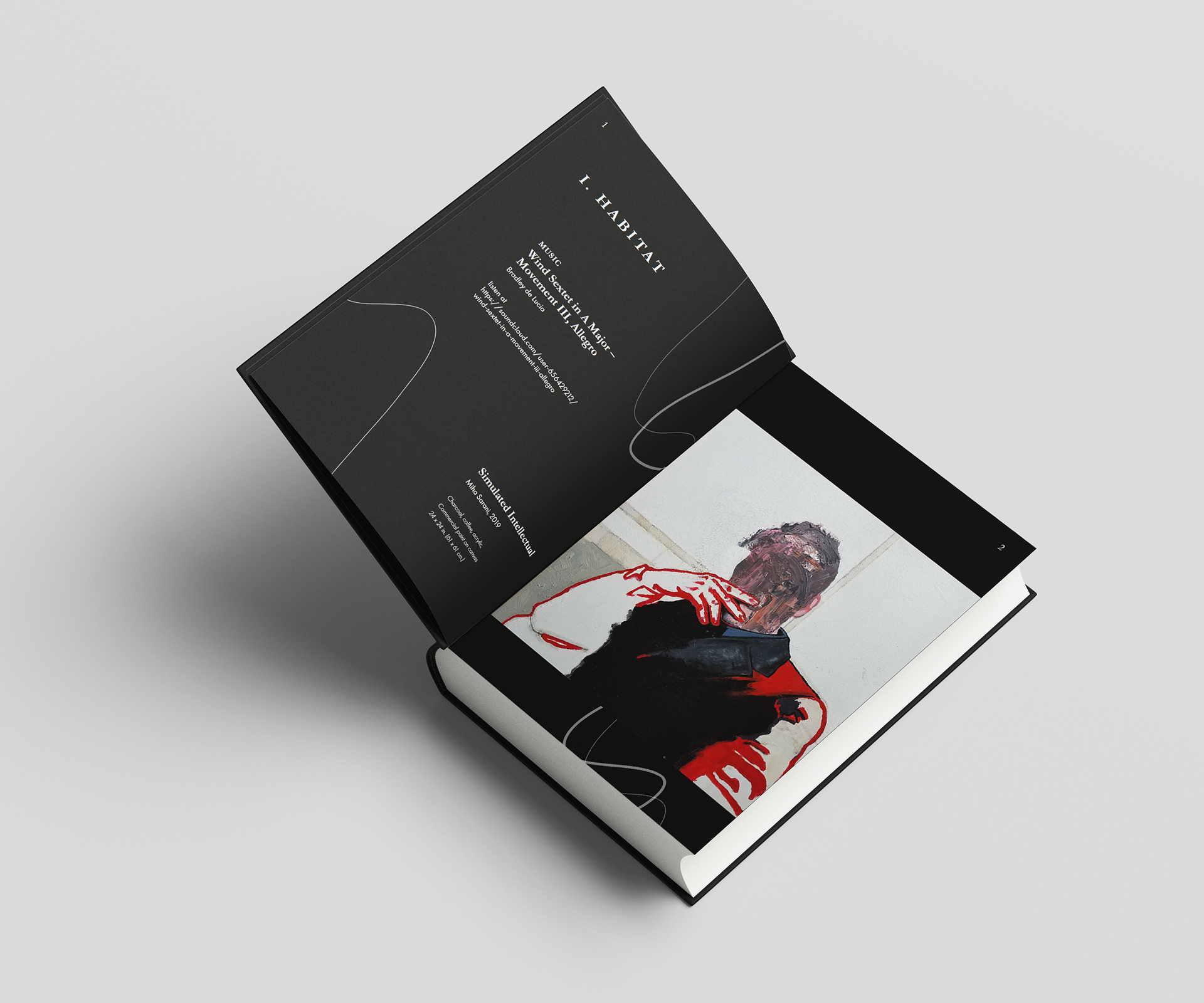
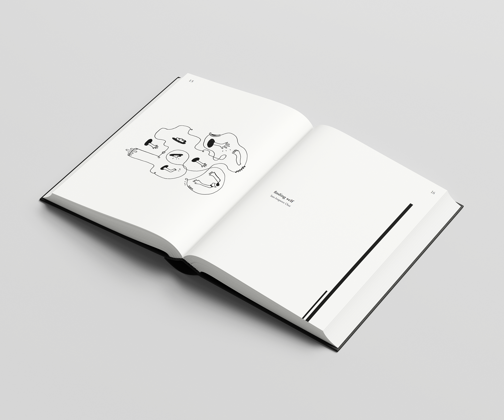
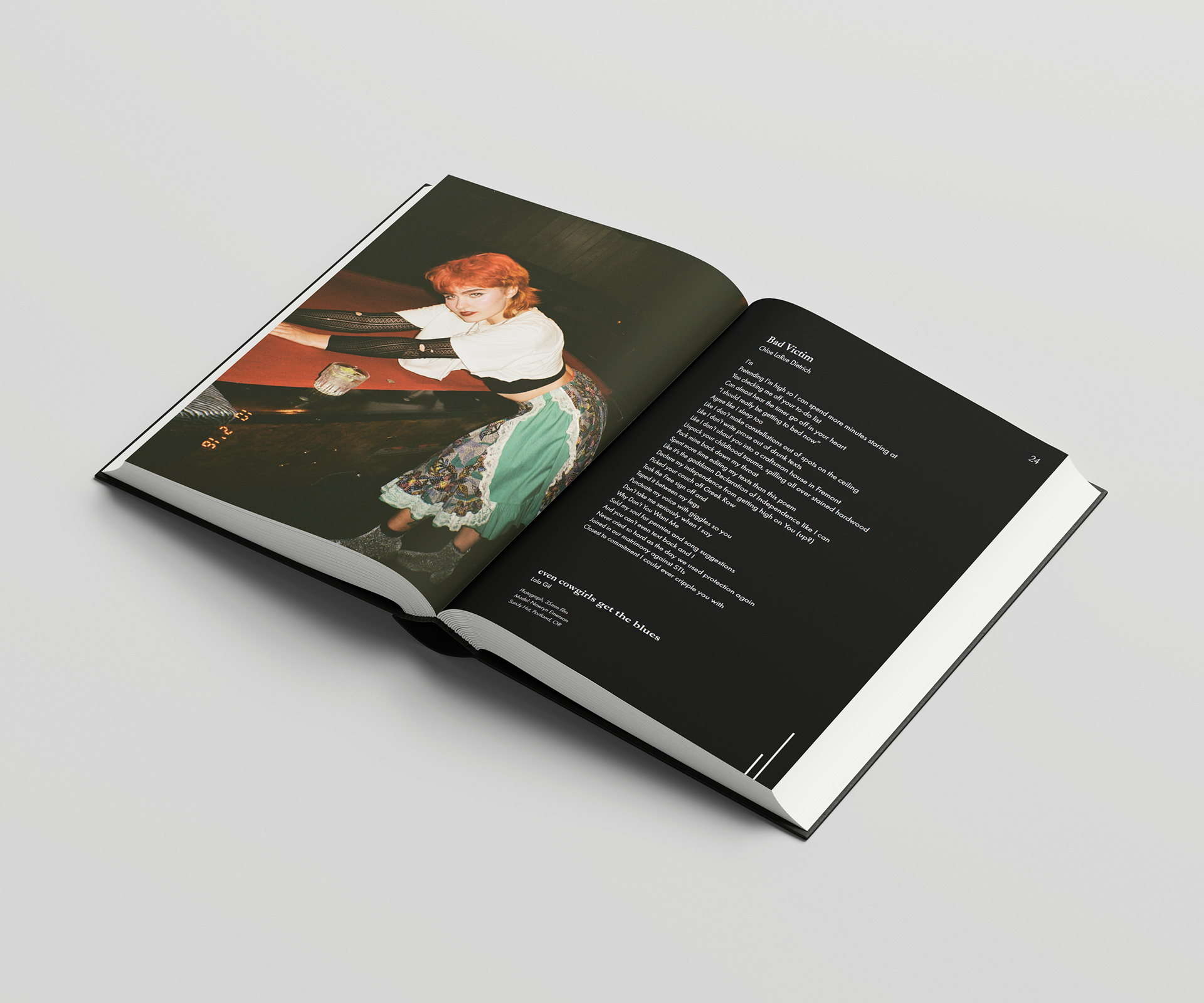
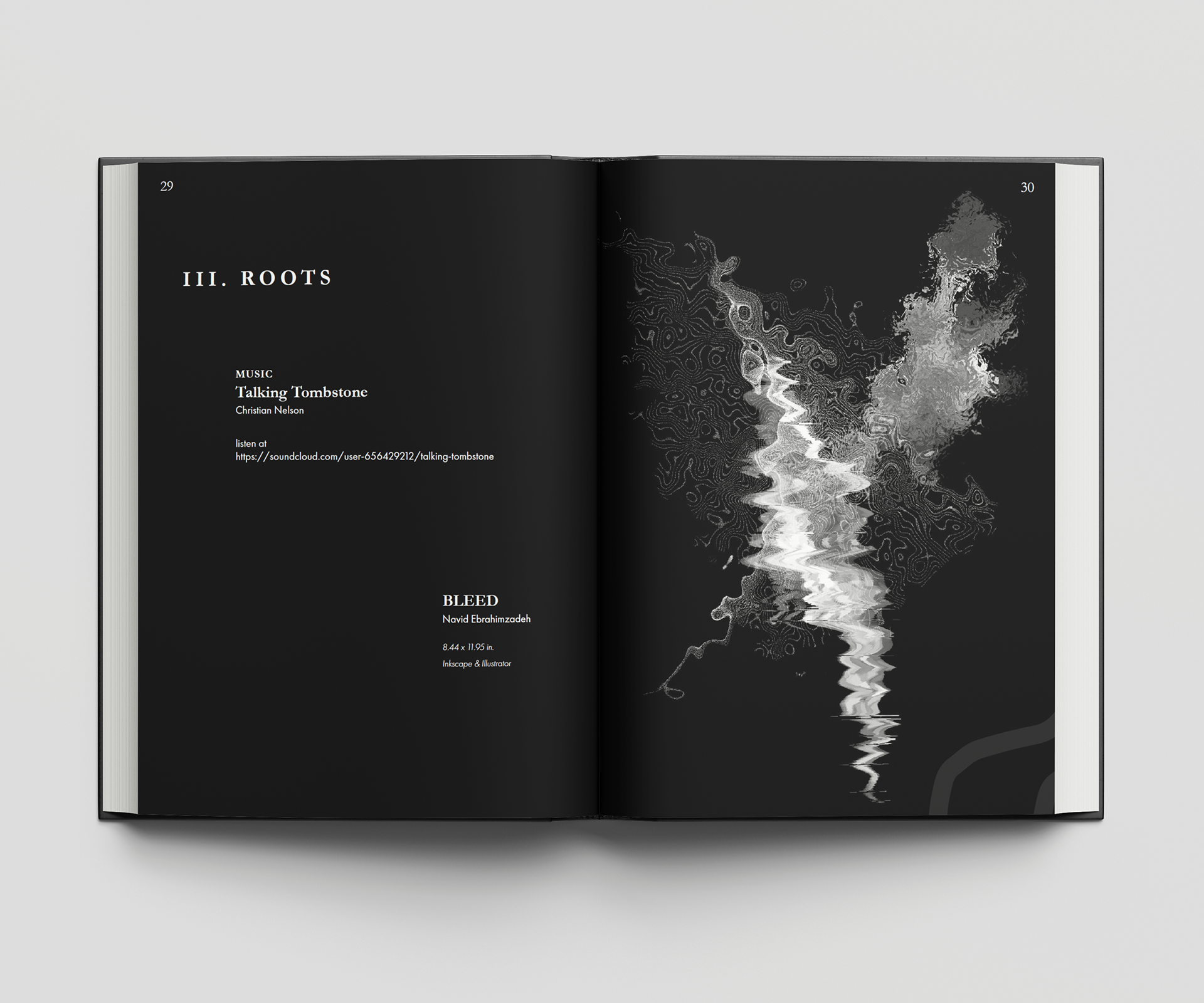
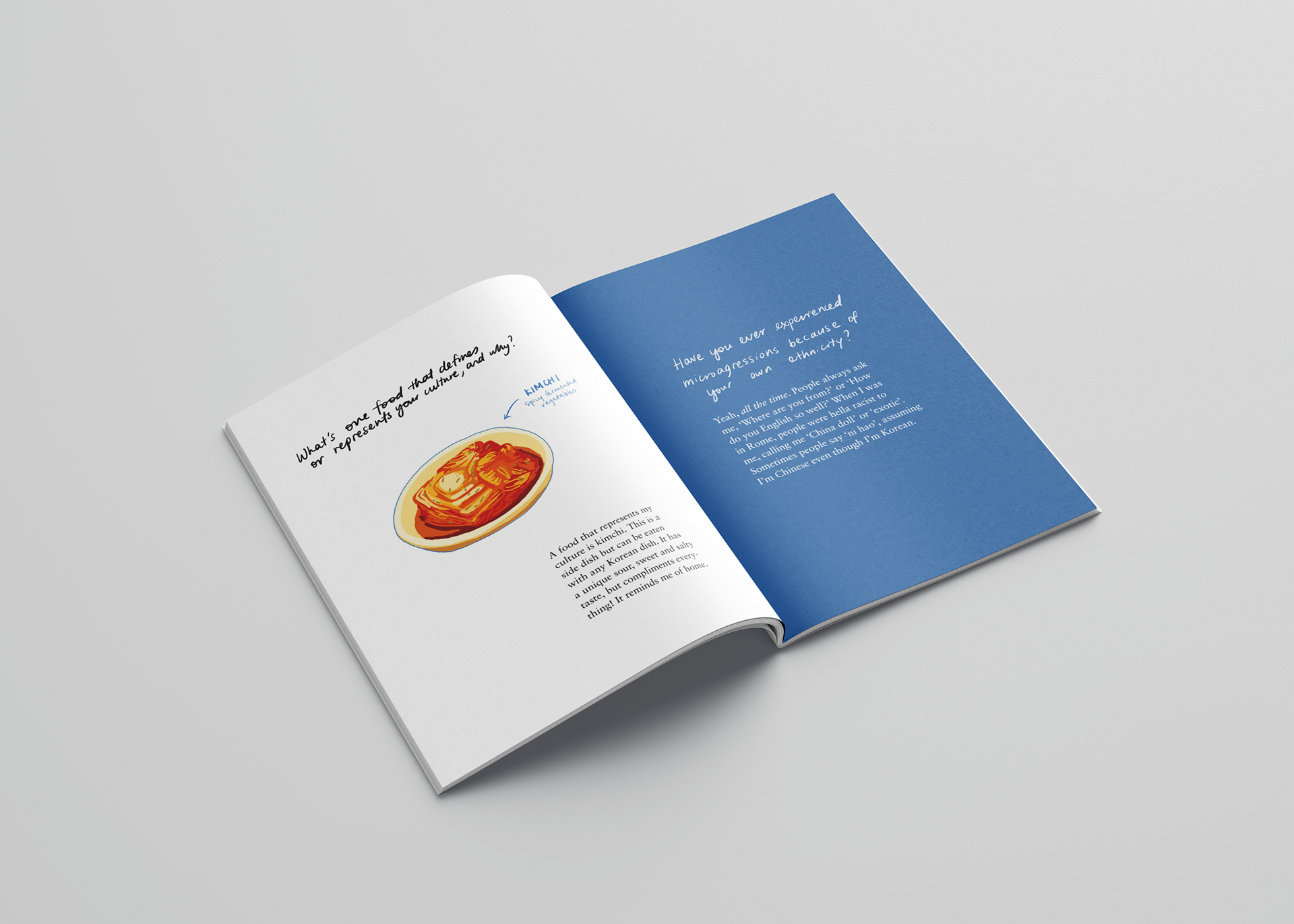
The Bricolage team and I worked together to decide on the order that the visuals and writing would be arranged in the book. From there, I came up with names for the different sections in the book based on the themes I observed, and added design details to unify each section. Overall, I went with a dark theme, as much of the subject material dealt with very heavy topics. I also chose to give each image a lot of negative space, in order to highlight these beautiful works of art.
LEARNINGS
Designing the layout for the entire publication was incredibly time-consuming, and yet I was thrilled to have the chance to do it. As a lover of art, writing, and design, this was the perfect job for me, and I realized that I truly have a passion for publication design. I learned a lot about the process of making an e-book, as we decided to sell digital copies in order to accommodate the COVID-19 pandemic. We also printed physical copies, so I also learned how to design and publish a physical book as well.

