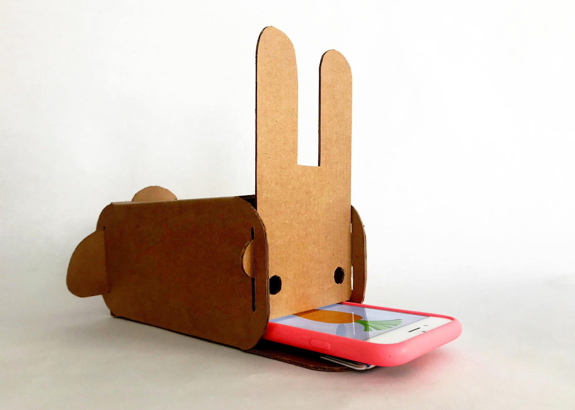
Project by Nadia Kaheil, Rachel DeNoble, Amixa-Ray Calzado, and Clara Too. Final mockup (above) by Nadia Kaheil and Rachel DeNoble.
PROBLEM SPACE
The Burke is an incredibly immersive and interactive space, but can be inaccessible to people with physical disabilities.
RESEARCH
We interviewed seniors and staff at the Burke Museum of Natural History and Culture, and found that the museum can be difficult to navigate for seniors* with vision and/or mobility impairments. We set out to craft a design response which would comfortably fit in the context of the Burke, granting accessibility which would enhance the experience for all visitors.
*We defined seniors as people who are 60+ years old.
Many seniors need to rest frequently, and seating is often far from content. With our design, seating will be part of the museum experience.
INSIGHT 1
Seating at the Burke is unsuitable for many seniors.
The few seats available were too low for seniors with back and joint problems to use - they knew they wouldn't be able to stand up again if they sat down. The museum had small portable stools, but these were not very comfortable to use. One visitor we spoke to on the bottom floor couldn't access the museum at all because of this seating issue, and stayed seated near the entrance while his family enjoyed the exhibits.
Our initial idea was an AR walker that could help with wayfinding in the museum.
Initially, we wanted to make an AR walker to give seniors continual physical and informational support as they navigated the museum. However, through critique we realized that the combination of a screen and a walker would be too bulky and unfamiliar for seniors to use.
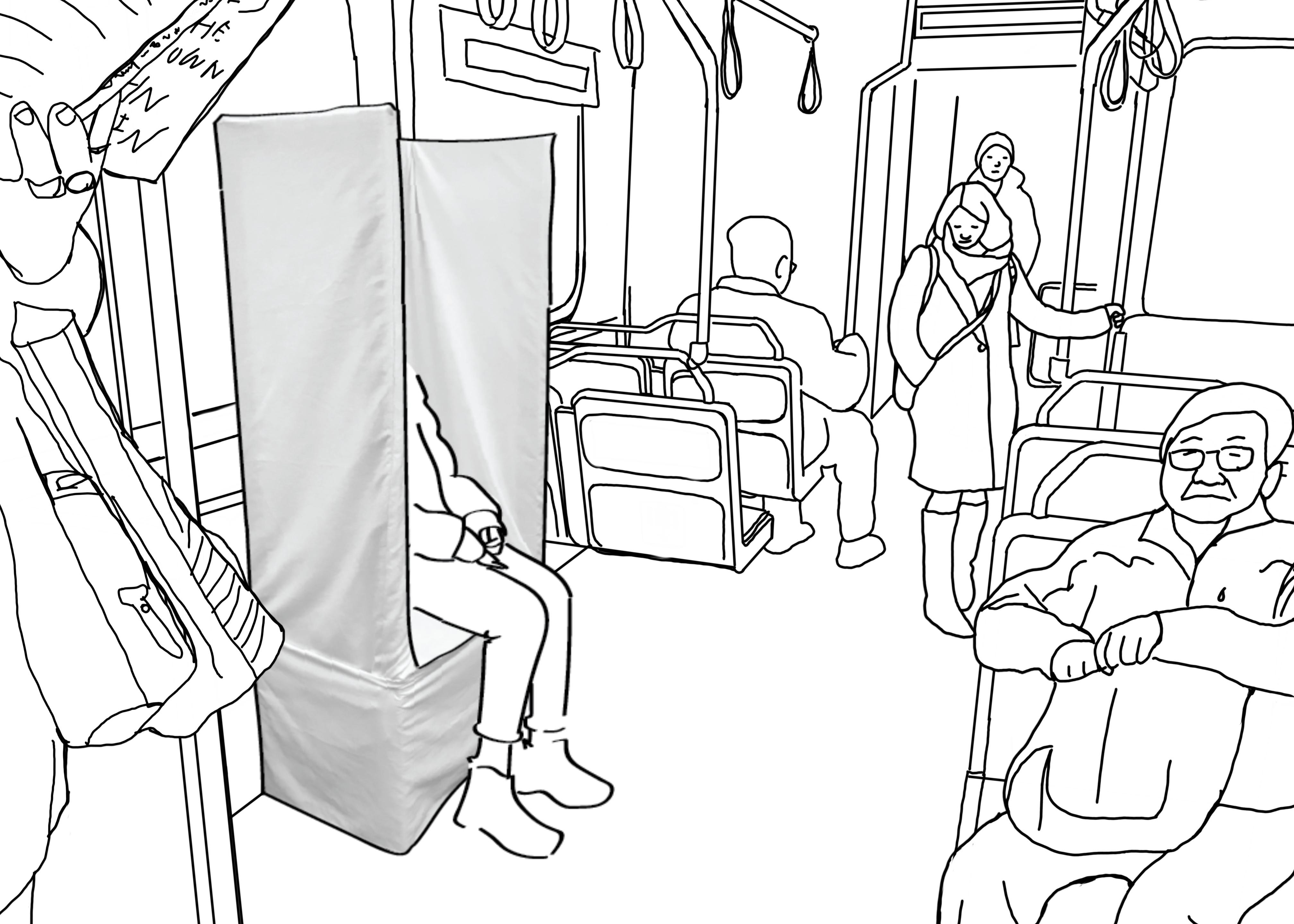
Therefore, our design response utilizes a much more familiar kind of technology to allow seniors to rest and learn at the same time. Within each exhibit, we recommend the installation of a mounted iPad-like informational screen with a handheld phone next to seated areas. We recommend armrests and higher seating to make this experience more comfortable and easy to navigate for senior citizens.
Our design recommends higher seating with armrests and informational modules.
INSIGHT 2
Senior visitors crave conversational interactions.
We observed that seniors enjoyed learning by talking to staff. We created an audio interaction based on the existing phone interactions already available in the Burke. These installations would allow visitors to hear audio recordings from museum curators, granting them in-depth information about the exhibit they are in. In addition, we added a feature that allows seniors to call for help in order to speak with staff in person, which could be helpful in case of an emergency or getting lost in the museum. Additionally, we included translations in Spanish and Chinese, in order to make it accessible for the elderly non-native English speakers we observed in the museum.
Visitors can hear directly from museum curators and staff, with accompanying text and images.
INSIGHT 3
Small text prevents seniors from being able to access museum content.
Many seniors could not read museum placards and signage because of the type size and poor lighting conditions. We chose to use DM Sans, a typeface with a large x-height, in order to maximize legibility. We kept our text size well above accessibility requirements. Additionally, we used large buttons with high contrast, and kept visuals minimal to make it as simple to use as possible. Because many seniors are unfamiliar with technology, we ensured that the interface would be flexible, allowing them to scroll forwards or backwards and access the home screen easily.
TASK FLOWS
Based on these three insights, we built our tablet application with the objective of completing the following task flows.
USER TESTING
User testing with an older participant, using iPads to simulate the experience.
During user testing, we noticed that there didn't seem to be much connection between the experience of using the technology and the physical exhibit. In order to facilitate a closer connection between the two, we changed the home screen to map directly to the view of the exhibit itself, as seen below. We confirmed through testing that the combination of audio and visuals made it easy to follow along and absorb additional information.
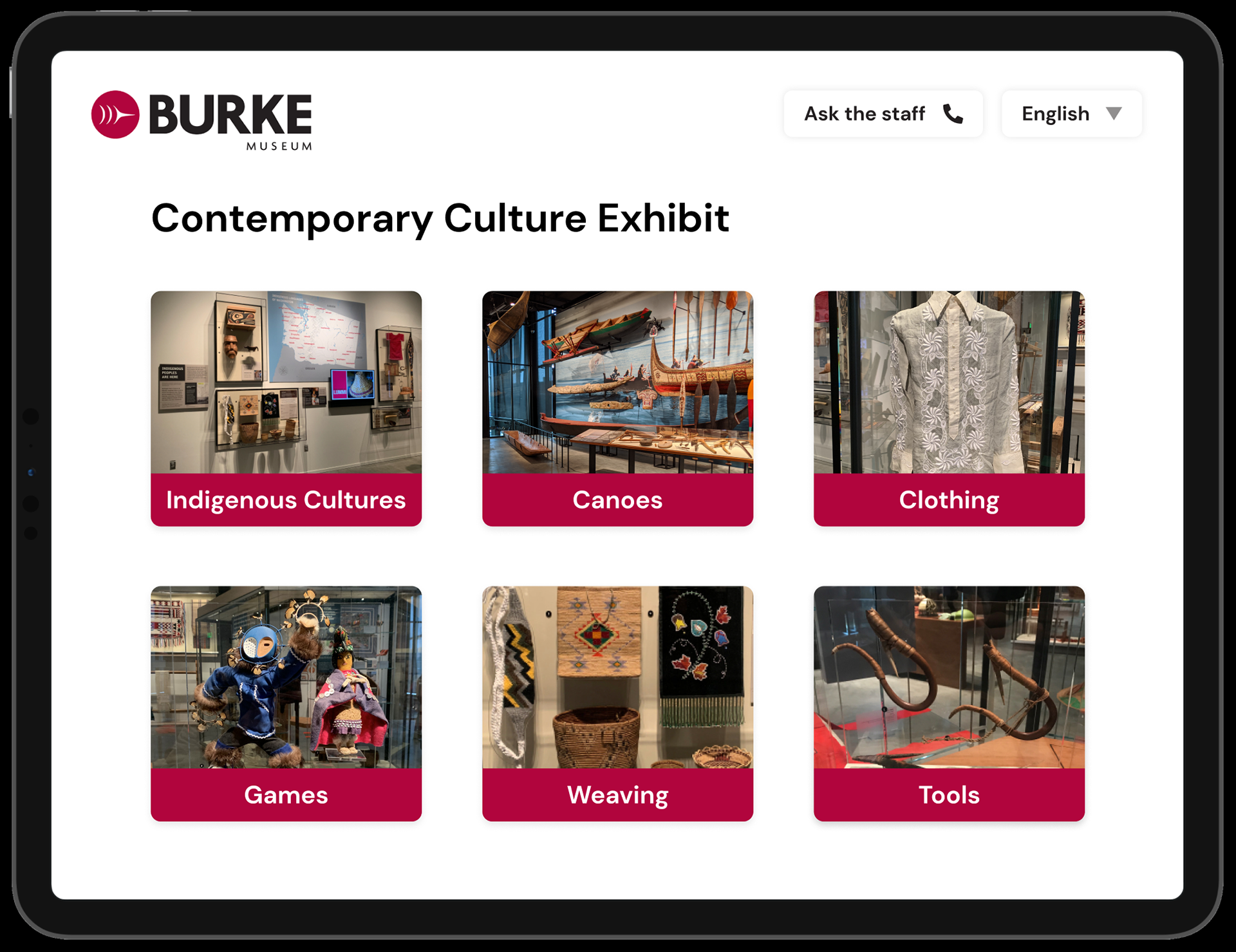
Previous iteration of home screen lacked 1:1 mapping
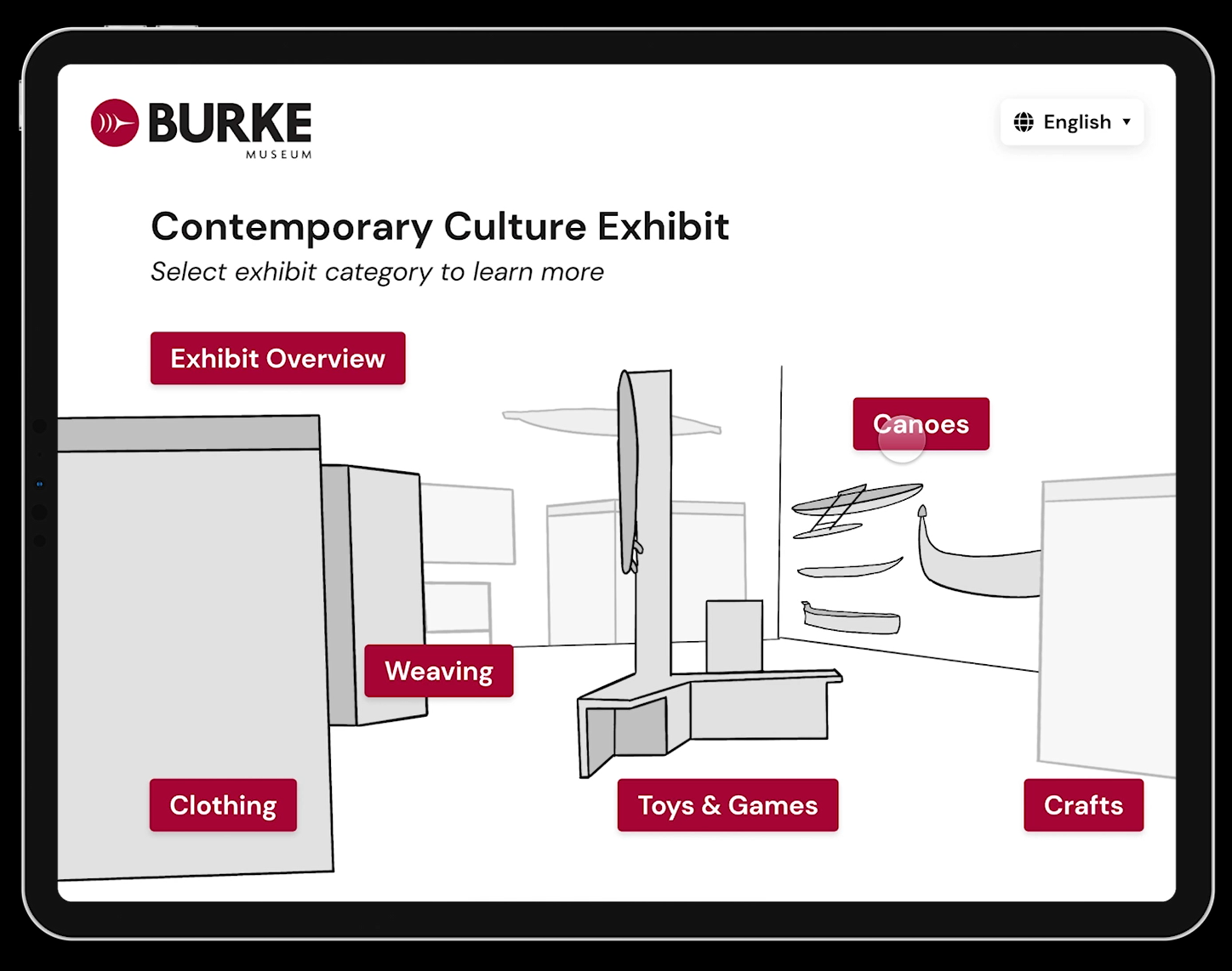
New home screen maps to user's view of the exhibit
The following video contains a walkthrough of the semi-final screen prototype.
FINAL MOCKUP
Nadia and Rachel further refined the home screen to feature a photo of the space rather than an illustration, in order to make it as simple as possible for users to tell what part of the exhibit the device was describing. They established clear 1:1 mapping between the interface and its environment.
LEARNINGS
Through the process of interviewing participants, I learned to overcome my fear of approaching strangers, and found that the seniors and staff were really kind and easy to talk to. We had thought-provoking conversations about how to make the museum more accessible. Although the museum was designed with accessibility in mind, I learned that there are always improvements that can be made to make the experience inclusive of everyone. I also learned to think very carefully about design considerations when it comes to screen design - every little detail can help make it easier or more difficult to use the application.
Created for Design 371: Interface Design I

