Project by Clara Too.
Buzz Bunny is a cardboard phone accessory intended to make waking up fun for d/Deaf children. In theory, this device syncs to a custom app that uses the light and vibration from the phone to wake the child. In order to switch off the alarm, the child 'feeds' Buzz Bunny the carrot on the phone screen.
In my research, I found that already-existing alarms for d/Deaf people usually involve some form of vibration or light, so I decided to follow these conventions in my design.
I created the cardboard form by hand using an X-ACTO knife and E-flute cardboard.
---
Design inspired by Jessie Zhang, my incredible Deaf housemate who loves bunnies.
Left: open-mouth bunny with phone
Right: closed-mouth bunny
PROCESS
As this was my first foray into industrial design, it took quite a few tries for me to land on a form for this alarm. As a class, we were tasked with coming up with any cardboard accessory to improve upon the experience of being woken up with a phone. Initially, I tried many different forms, including one which would turn off when taking glasses out of the container, as well as one which would stop when a coin was dropped into it.
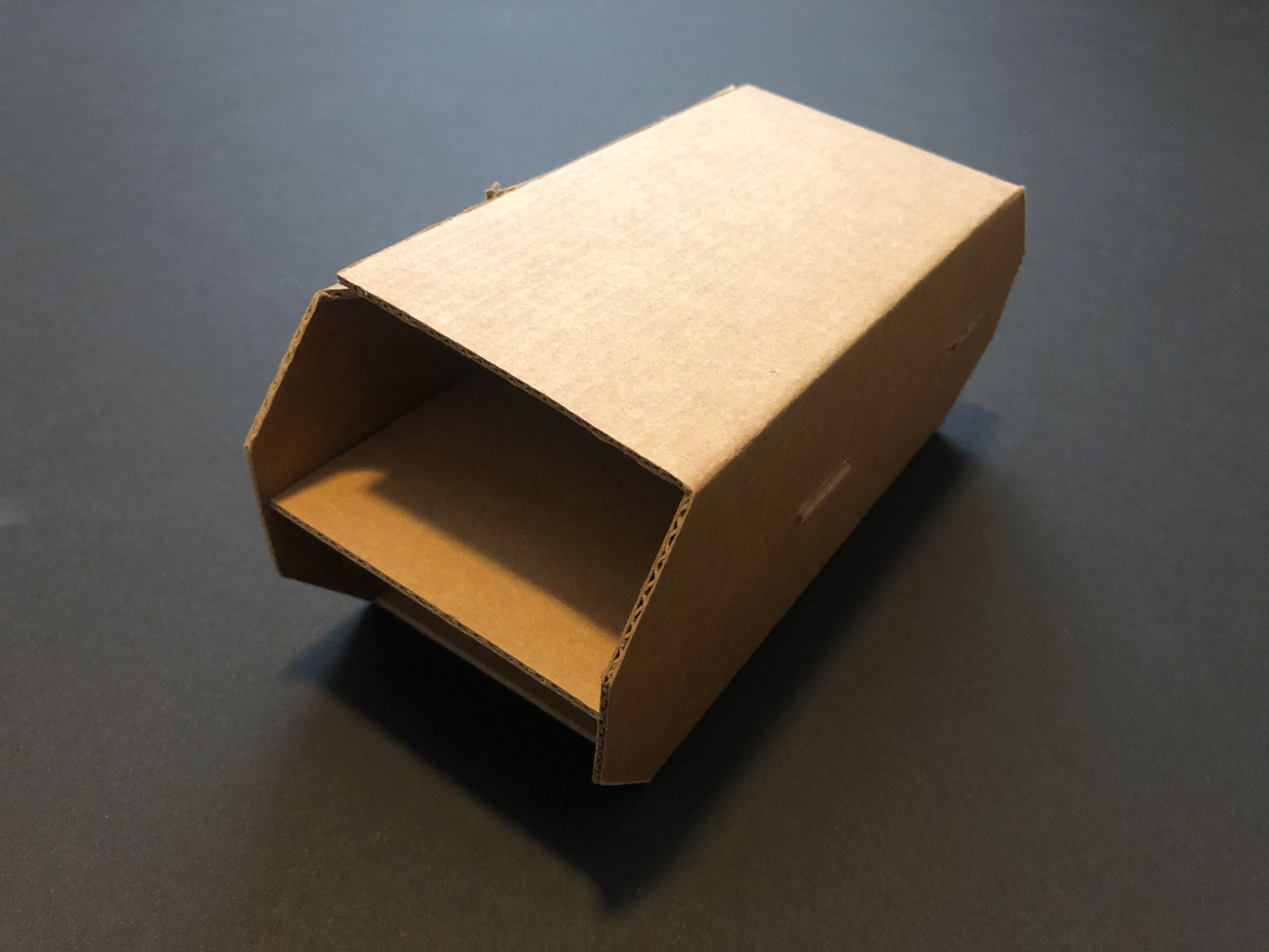
Glasses Alarm (with two compartments)
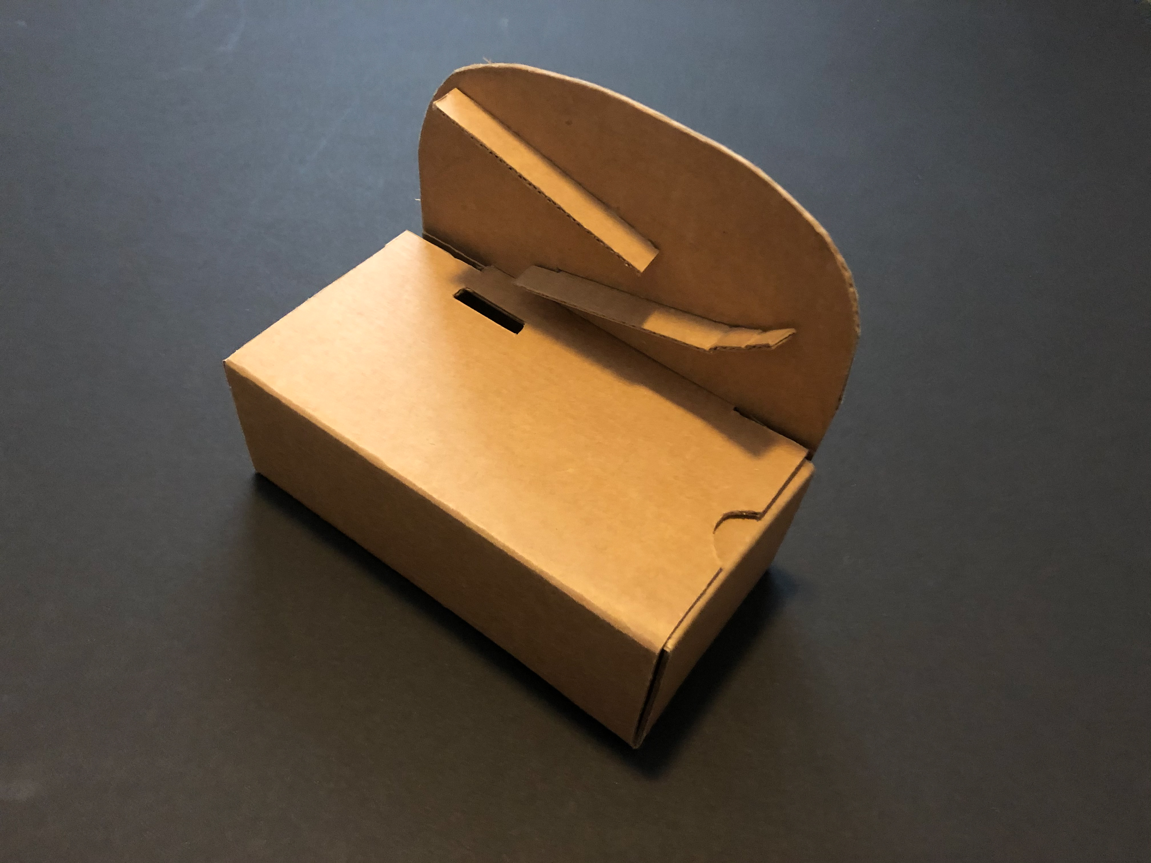
Coin Drop Alarm
I finally landed upon the idea of a bunny alarm during a conversation with my housemates, one of whom was a Design senior, who made an offhand comment that our Deaf housemate Jessie would make a great creative constraint. I decided to run with the idea and design an alarm specifically for her.
Process storyboard - initially the user would turn off the alarm by 'soothing' the bunny's ears.
ITERATIONS
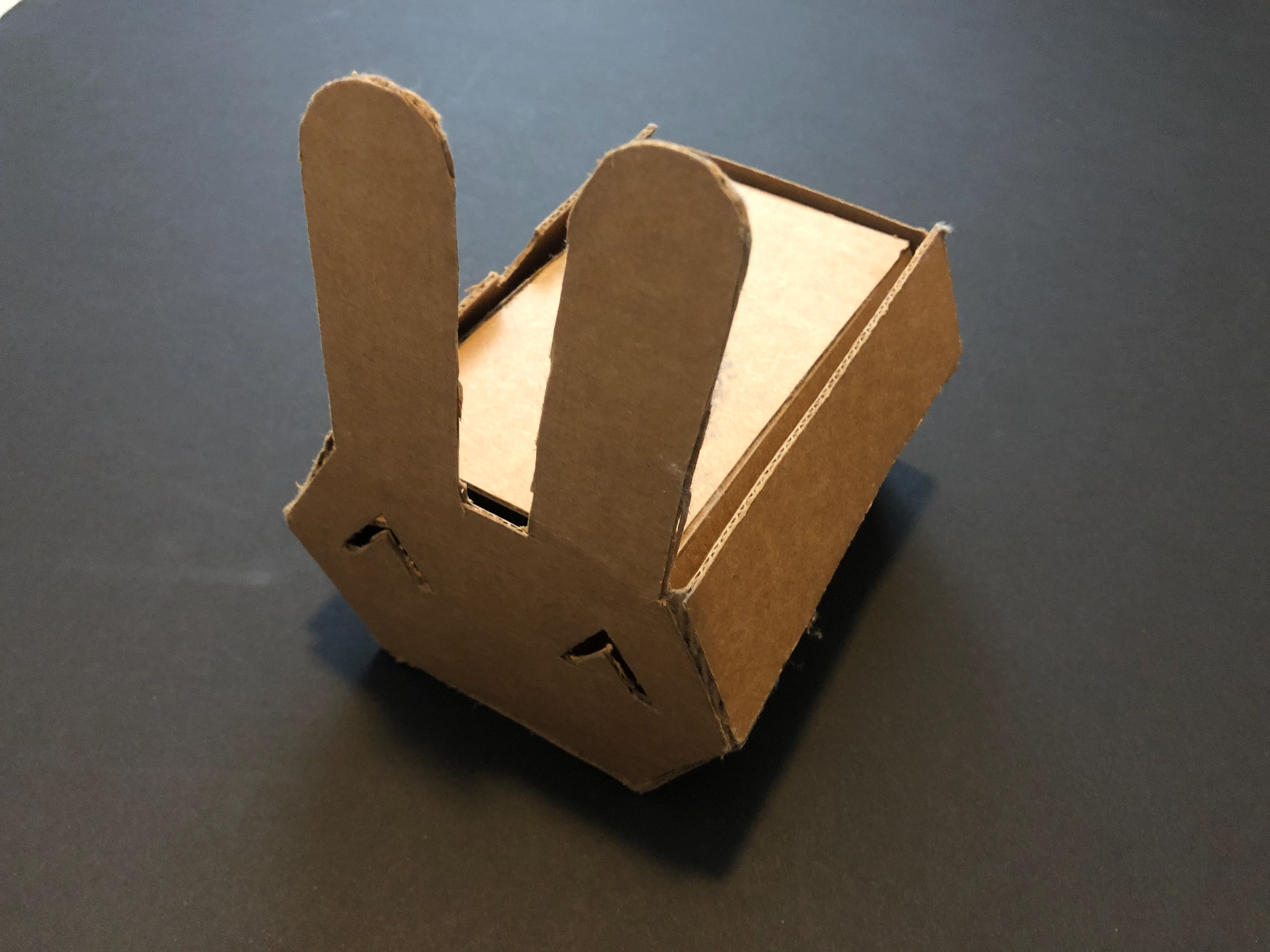
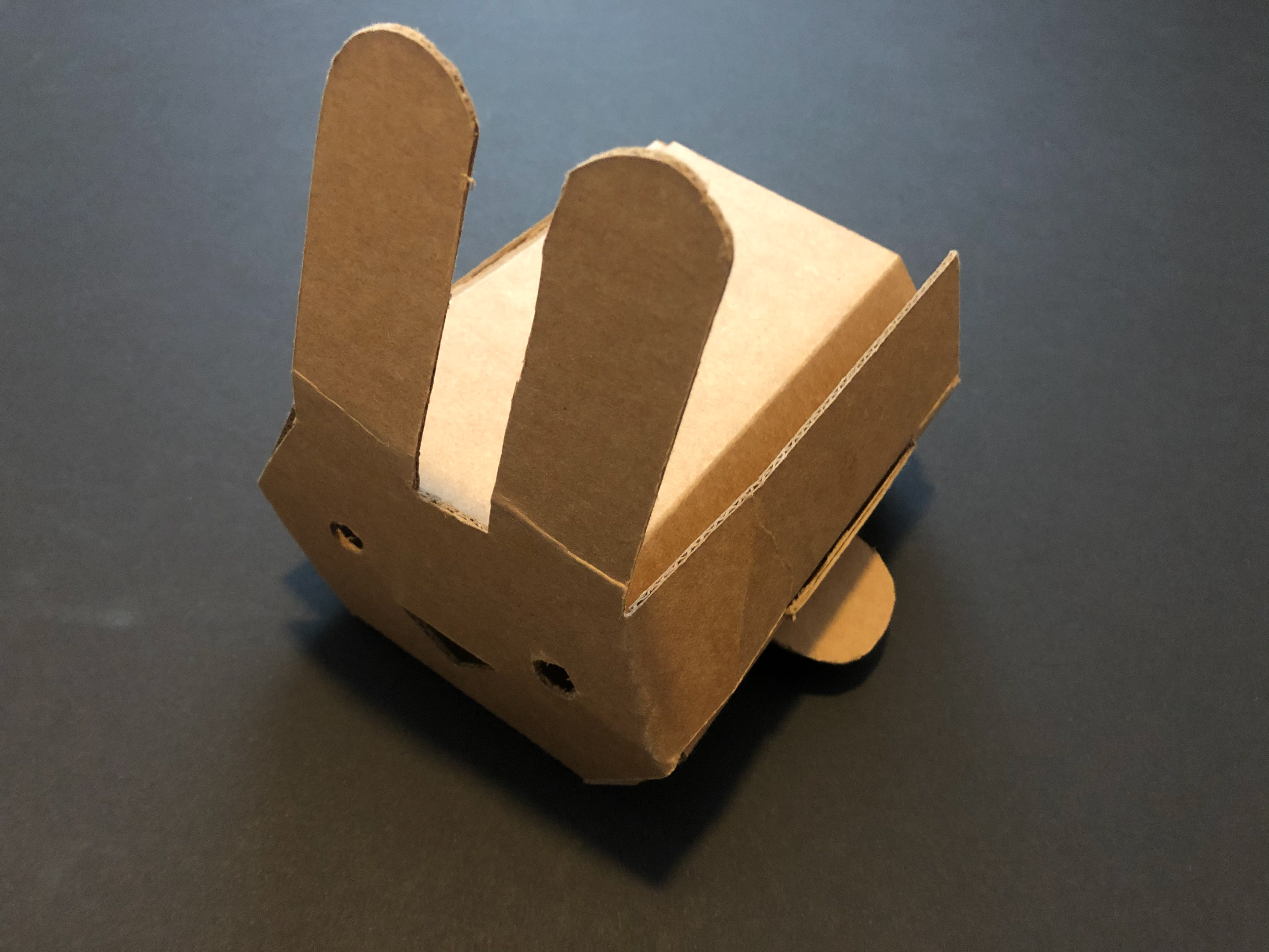
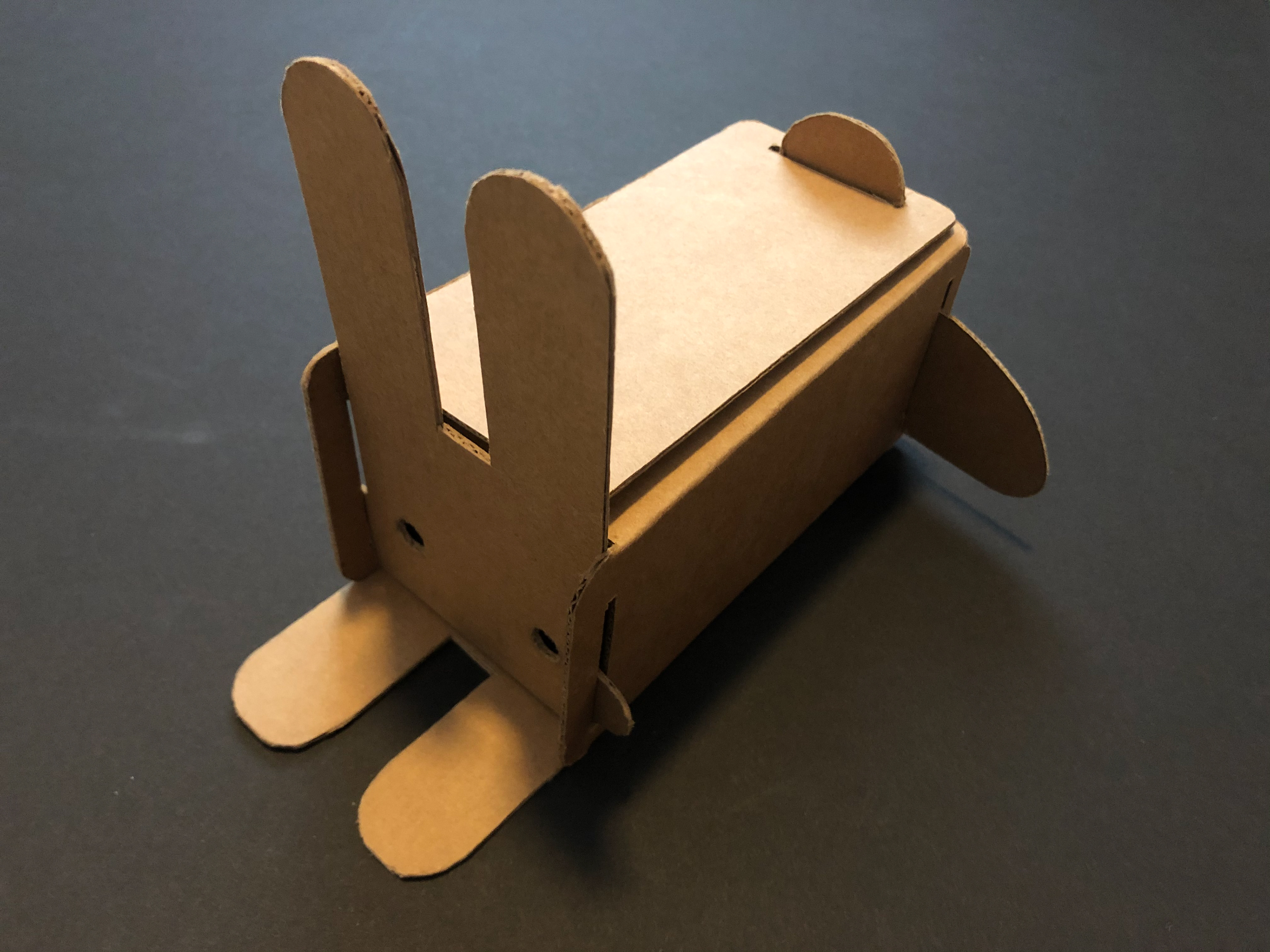
It took me many tries to refine the shape of the bunny alarm. At first my cuts were ragged, as I was using too much force. Eventually I learned to use multiple strokes to get a clean cut with the X-ACTO knife. Additionally, I struggled to figure out how the bunny could be opened in an easy way, as opening up the top of my first two iterations was very difficult and damaged the integrity of the structure. I eventually changed the original hexagonal form to a more boxy shape, so that the face could move up and down to simulate the 'eating' of the carrot. The third iteration was very close to being done, but I made a fourth one, since the measurements were slightly off and I wanted to tighten it up for the final.
INTERFACE MICROCOPY
Given that this product is intended for deaf children, it is important to provide clear instructions in the app interface so that they can easily turn off the alarm. To avoid causing frustration or confusion, I used simple words that a child could read. I used first person language from the perspective of the bunny to establish an immediate connection between the child and the bunny, and to make the bunny come alive. I used exclamation marks to indicate a sense of excitement and encouragement.
LEARNINGS
I learned that interpersonal relationships can be a really rich source of inspiration for design. It was my first time working with cardboard, so it took many tries to get it right. Every single iteration got better and better, and I learned that patience and persistence are the keys to good design. And I also felt inspired to continue designing for marginalized communities, as this is where my passion lies.
Created for Design 166: Design Foundations

